The Crawford House
I’ve known the owners of the Crawford House for years. In fact, I worked on their second floor renovation and redo over five years ago. At that point in time, we had discussed the main floor, but to make the project less overwhelming for the homeowners, we decided to break it into two different scopes of work, starting with the second floor and working our way to the main floor, now years later.
The owners of this house have enjoyed it for over 25 years while raising their two now adult children in it. As empty nesters their priorities in the main floor design were very specific. The design needed to be thoughtfully created with both resale in mind, incorporating many of their existing possessions, and staying within our values of sustainability. They also wanted to be mindful that any new furniture pieces purchased, will likely need to be easily incorporated into a smaller condo in the future.
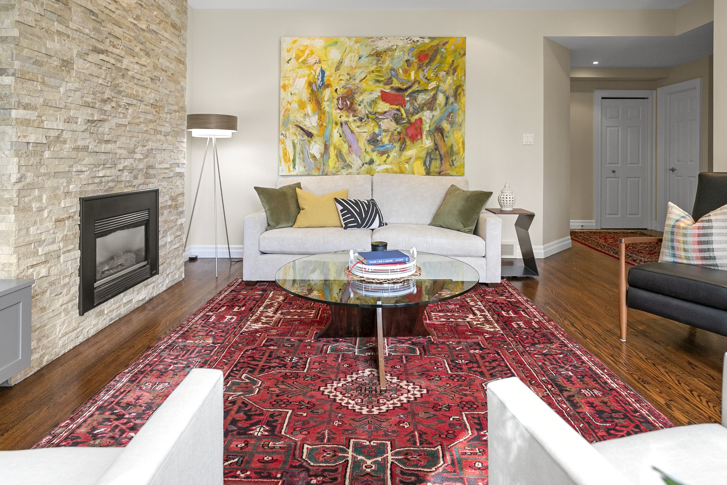
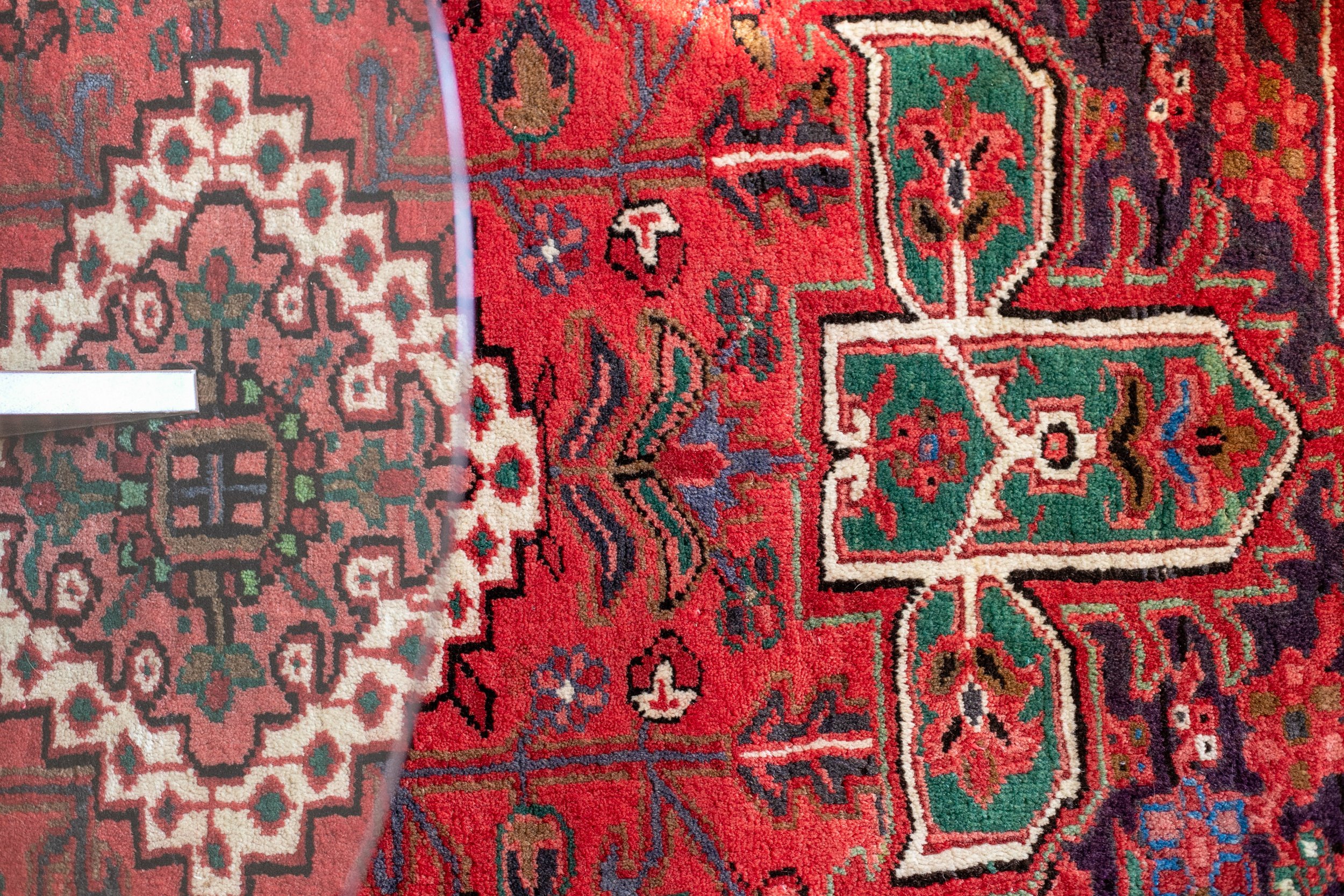
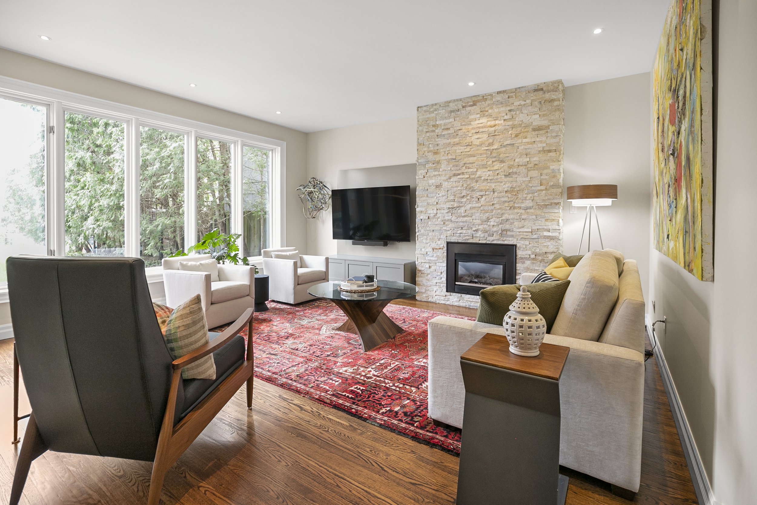
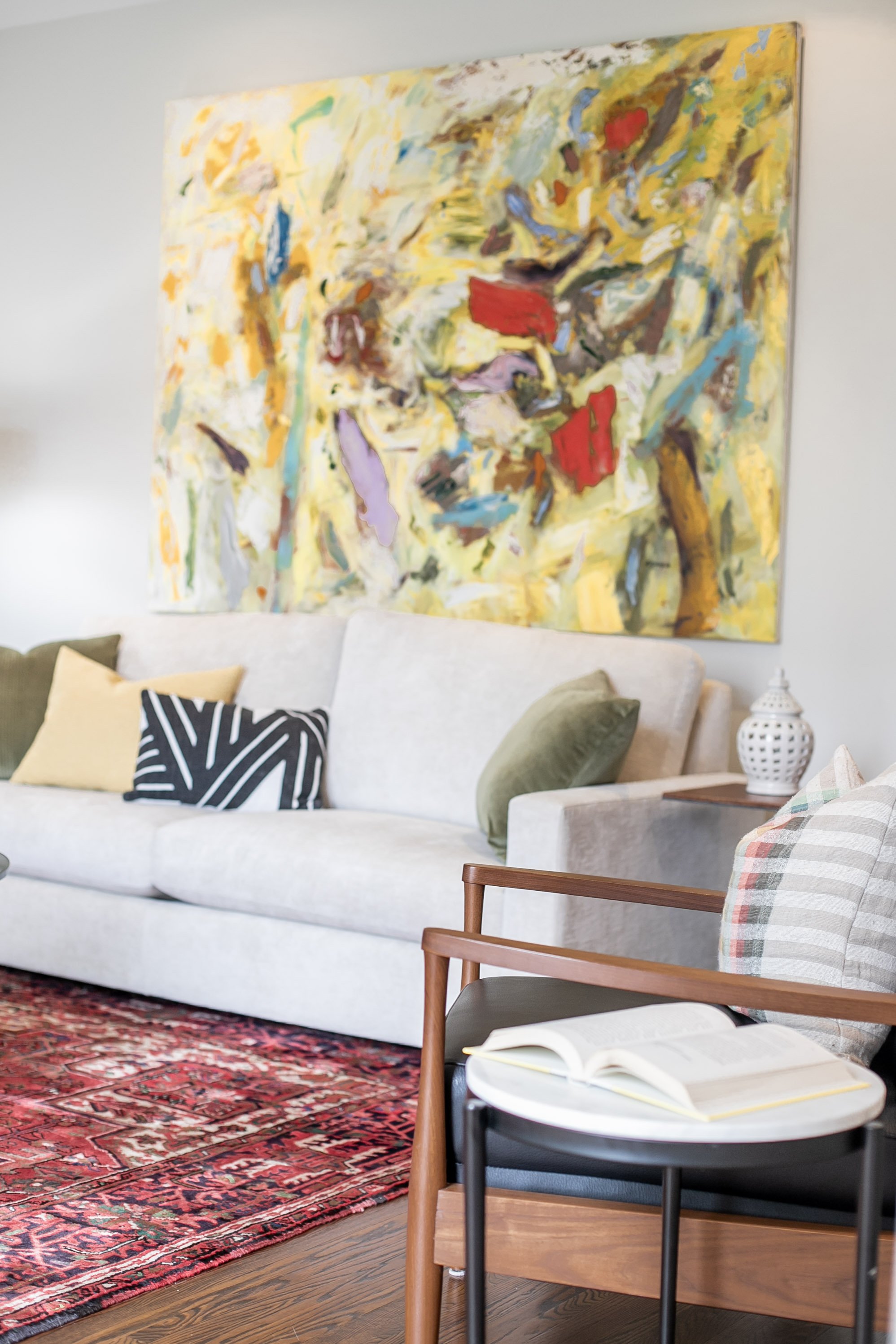
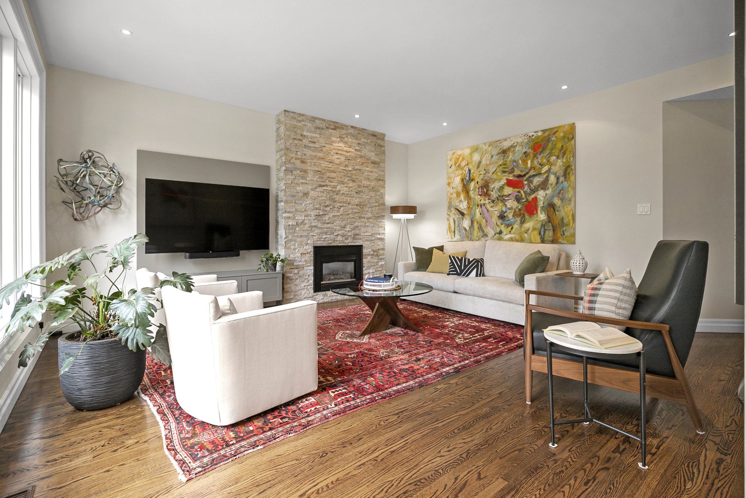
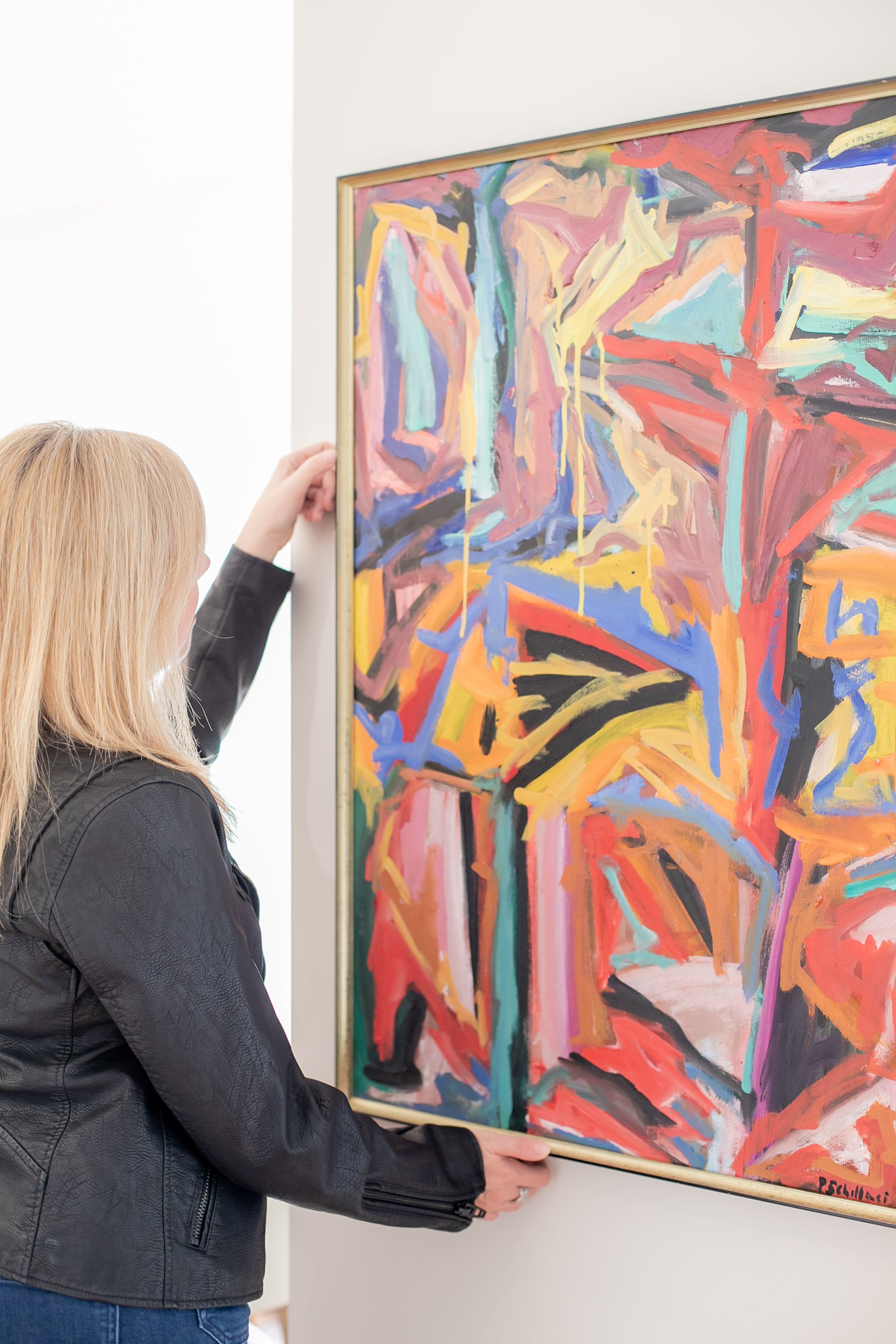
Keeping all of this in mind, we decided to maintain the existing footprint, and enhance the space rather than tear everything down completely. Through a detailed interview process the clients were able to pinpoint their favourite pieces of art, furniture and features of the house as well as any issues. With all of this information, we determined that our jumping off point for the design needed to start in the family room. To begin with we decided to keep the existing fireplace and move their existing living room rug and their favourite piece of art to this room. The design started with these key pieces in mind.
We pulled warm off-whites, and green/grays from the fireplace and carpet that we incorporated in different ways throughout the main floor, including in the kitchen and media center millwork. We kept our wall colours and furniture on the light side to allow their beautiful art to pop and to continue the drama from the art, we added toss cushions with vibrant colours on the sofa.
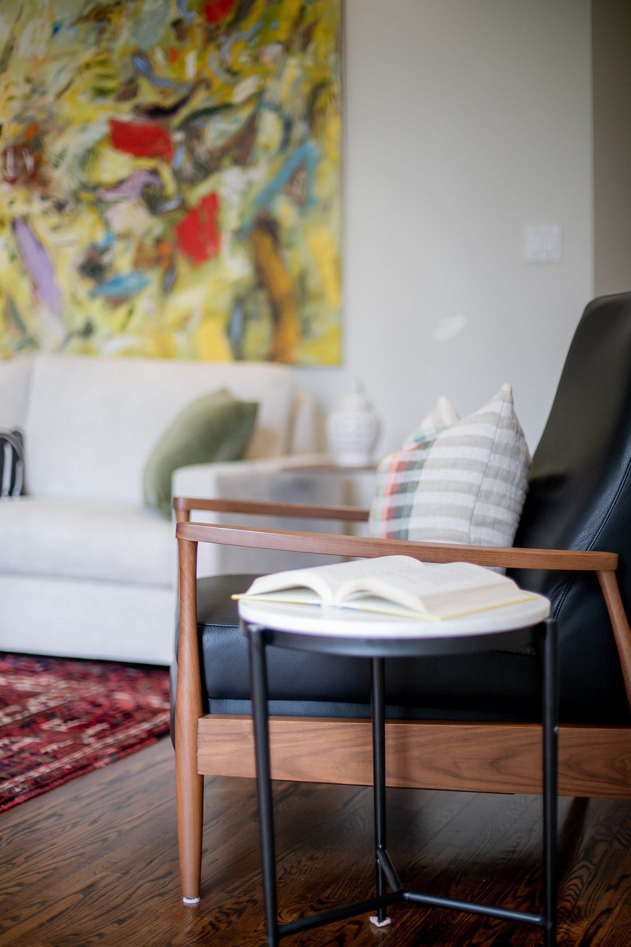
The family room furniture is all newly purchased and thus we chose smaller scale furniture that could be easily moved into a condo or smaller dwelling in the future when they chose to downsize. Keeping the pieces neutral would enable them to move them into any room in the future, rather than confining them to one space. We pulled warmth using walnut accents and grounded the space using pops of black with accent furniture and the recliner. We continued this theme in the kitchen, which sits adjacent to the family room.
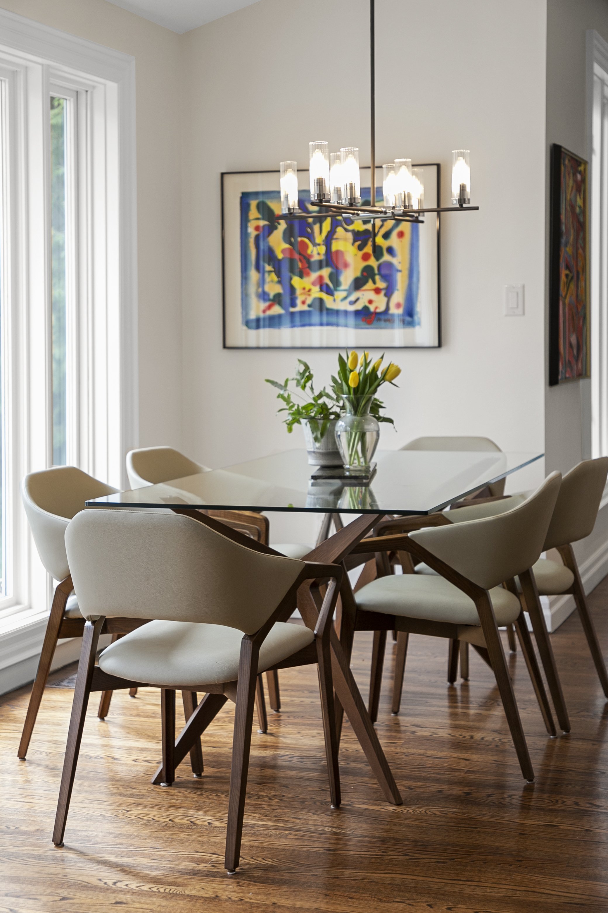
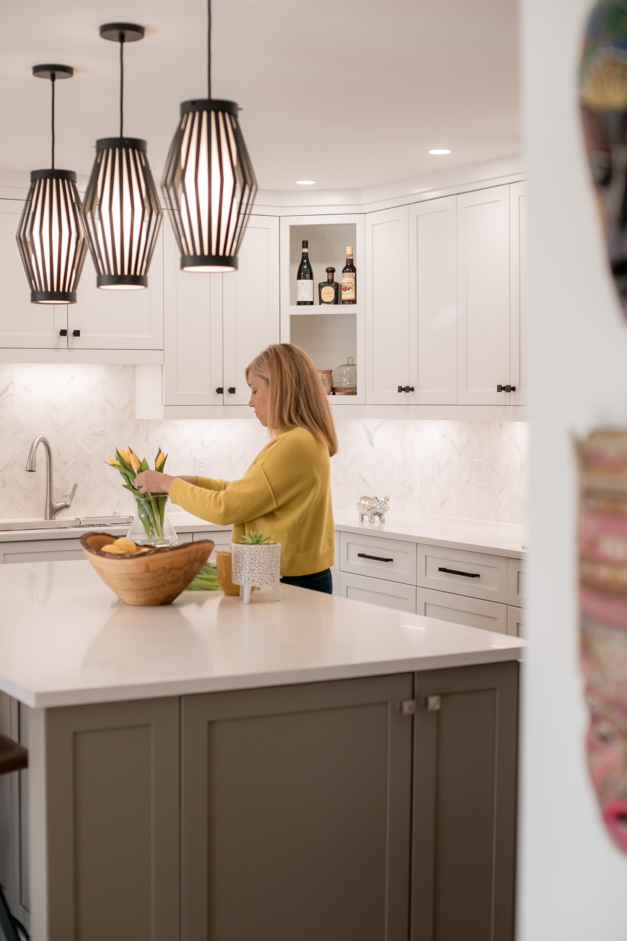
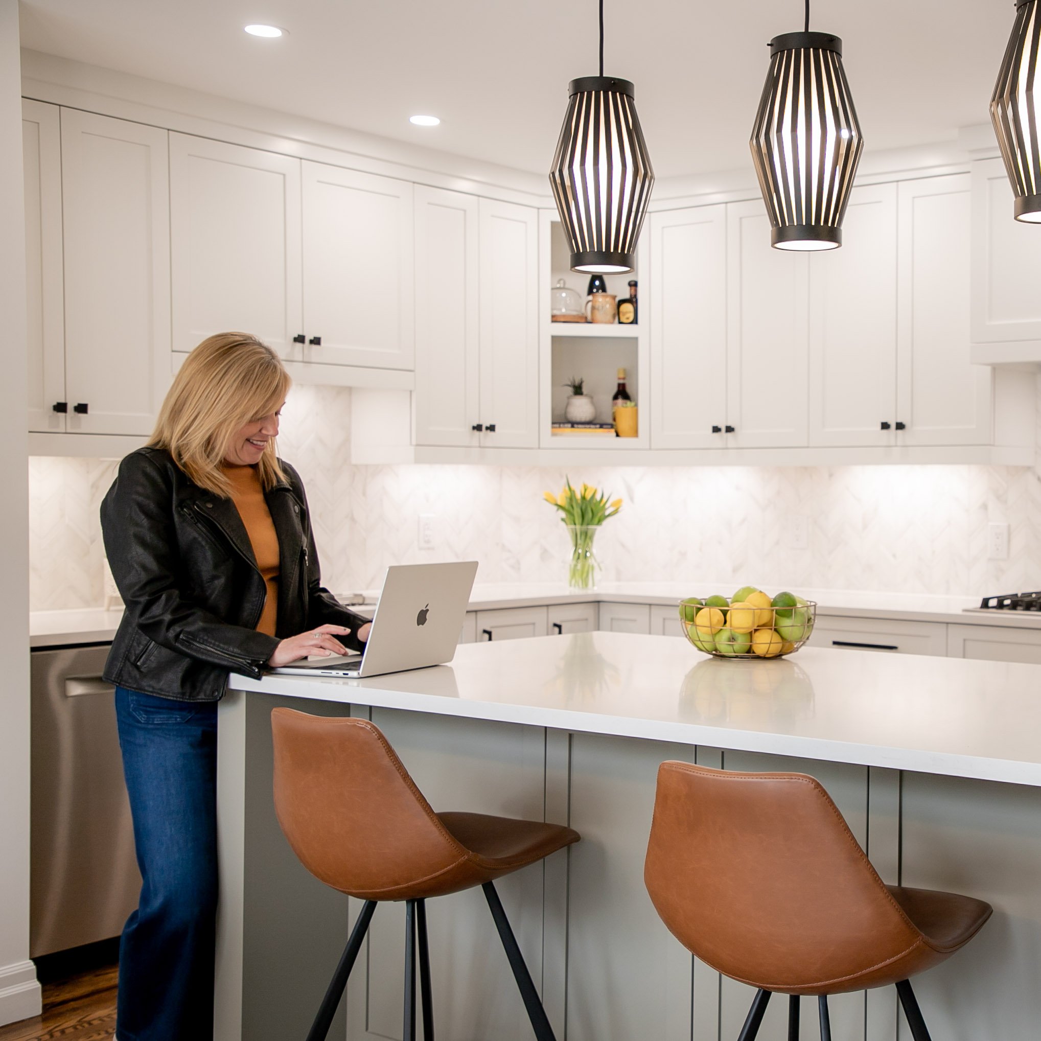
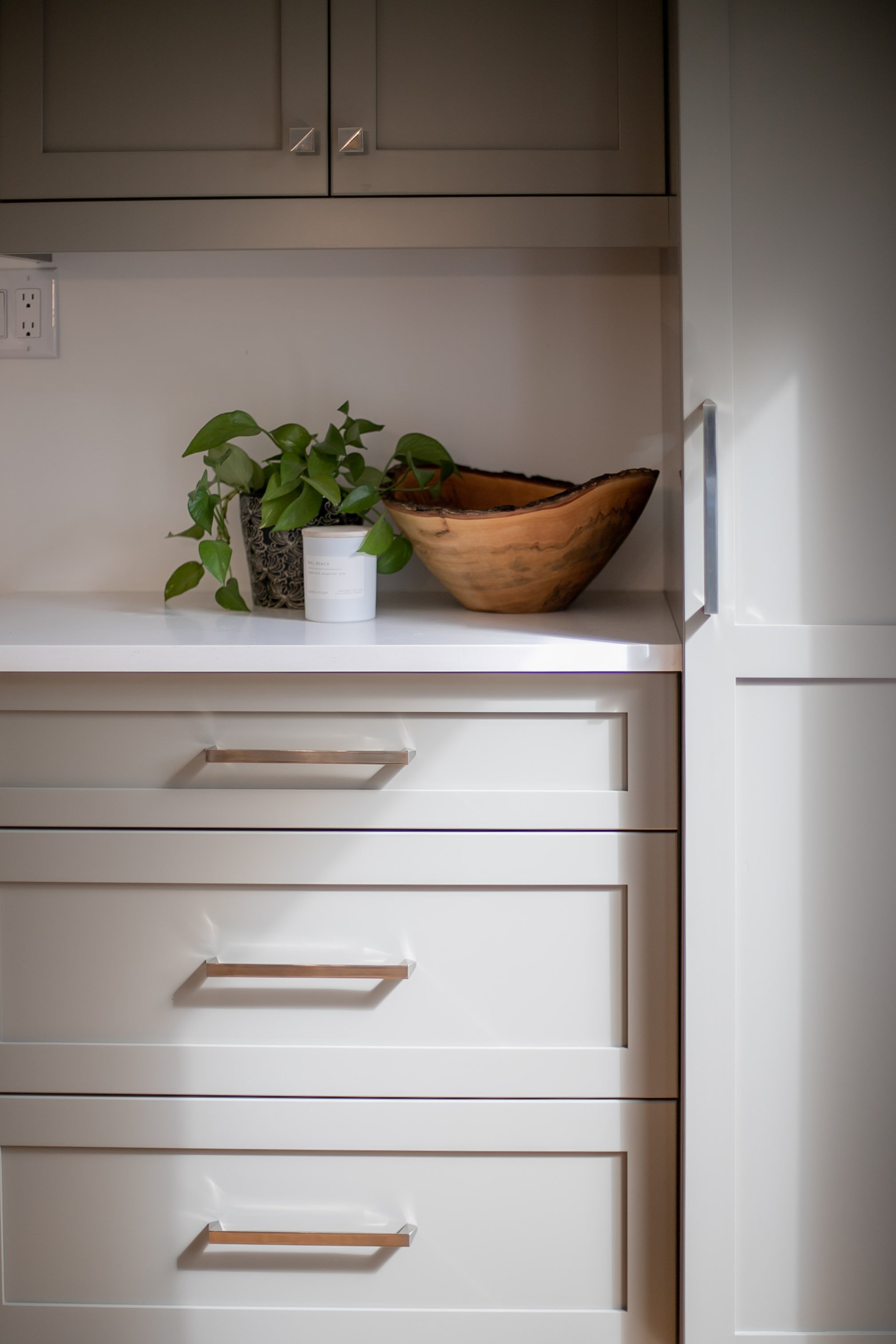
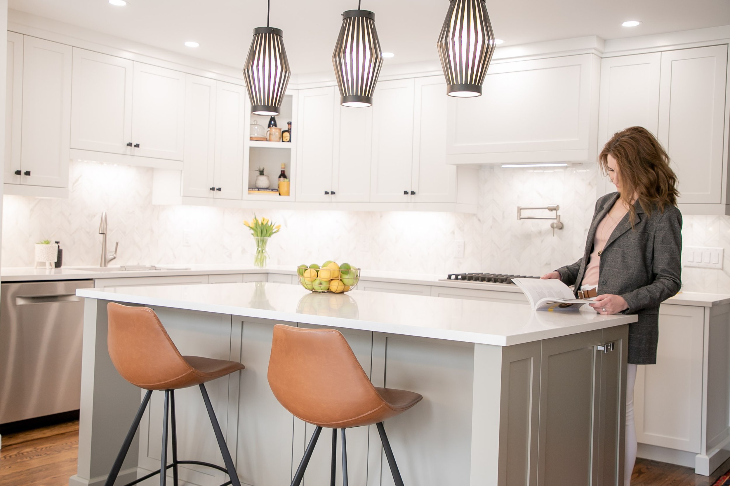
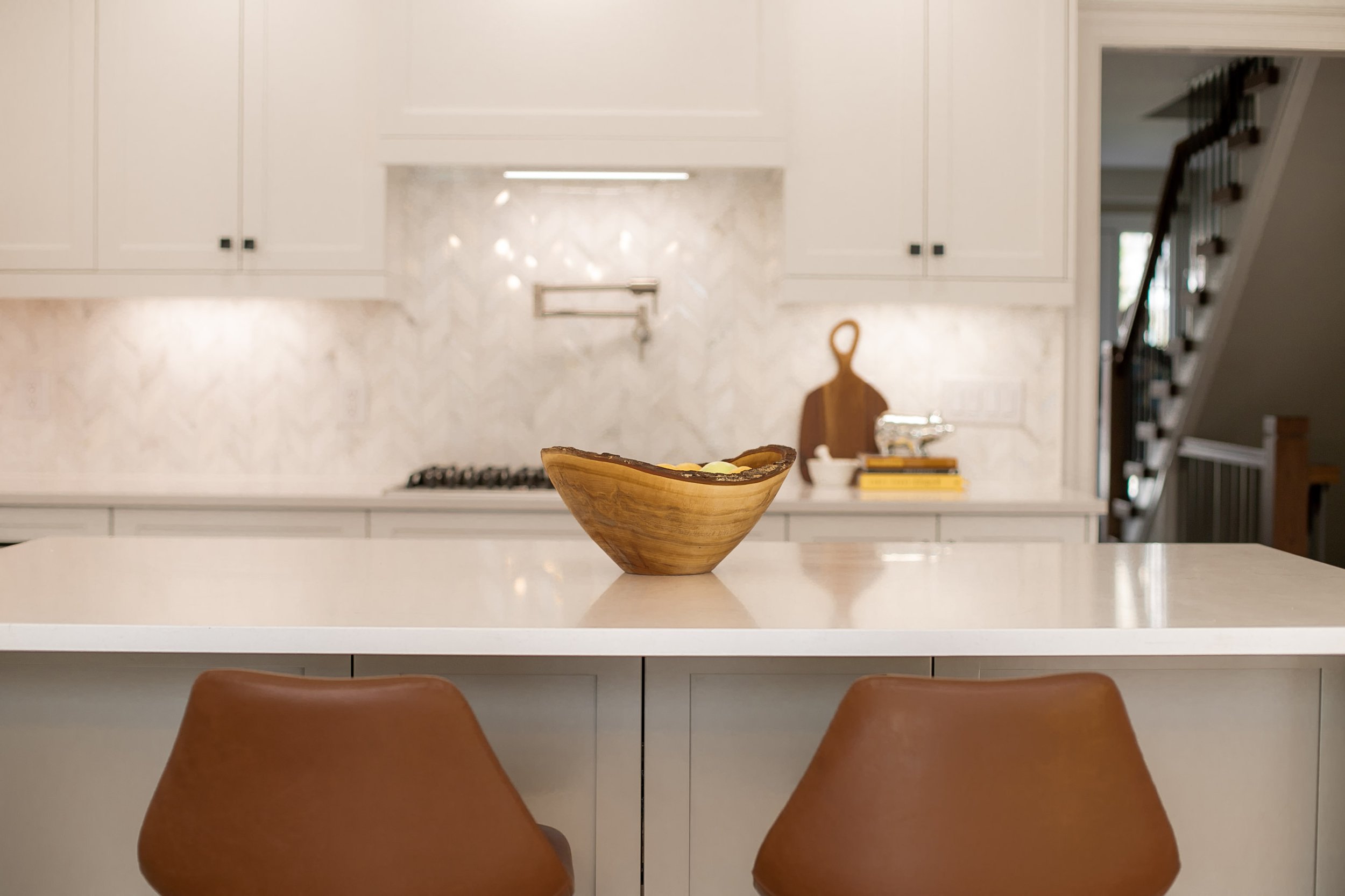
The kitchen’s footprint moved slightly to modernize the space and create a better workflow. Their existing hardwood floors stayed in place, so we needed to be mindful of cabinetry location. As a resale feature, we incorporated bright white cabinetry and interspersed the warm grey/green colour on the island and drop zone space to add contrast and to tie in the family room. The warmth derived from walnut and the colour itself was incorporated into the dining chairs and caramel stools at the island. To add pops of colour throughout we incorporated their existing art and some accessories.
I absolutely love the feelings of warmth, comfort and playfulness that this house pulls now from the changes that we made. I love that their beautiful backyard is highlighted with the light colours on the walls. I find comfort in knowing that by keeping the overall footprint of the main floor we were able to keep the hardwood floors, the trim, and doors, which reduced the amount of construction waste substantially. On top of that, I’m so happy that we reimagined the fireplace and gave it new life and balance in the room by simply adding a media unit to the other side and painting the walls a soft off-white.
The important takeaways from this are first, take your time and live in the space to understand the pain points and positive features. Second, tearing everything out isn’t always necessary. Instead, reimagine the space and thoughtfully plan it as we did in the case of this house, the Crawford House.

